
B R A N D B R I E F ( F I C T I O N A L )
The family-owned legacy business of handmade chocolate wanted to revive the recipe of the chocolate, which has been formulated by the ancestors with a philosophical intent of wellbeing, to cater towards the young generation while reviving the cultural essence of the product while having a modern and premium outlook to stay relevant.


B R A N D S T R A T E G Y
The brand wanted to revive the cultural essence and legacy of the recipe to be the forefront the positioning, while inculcating the attributes of being modern and premium in order to stay relevant. The key attributes of the marketing spectrum were taken into consideration while formulating the brand core.

S T R A T E G Y T H R O U G H I N S I G H T S
Choosing niche over grandiosity
There was a conscious focus to position the brand as a homegrown brand yet being a premium label, without competing with the other brands or industry standards within the chocolate domain, which focuses on grandiosity to be a vital design language in the premium segment. The brand wanted to demonstrate the values that its a niche independent brand which produced small batches of handcrafted chocolate infused with cultural legacy and wellbeing. This was strongly linked with the consumer preferences as well, wherein the consumers of today are emphasising on the product value and brand meaning to experiment with niche brands than preferring big names, which aligned with the brand's core of positioning as a homegrown brand.


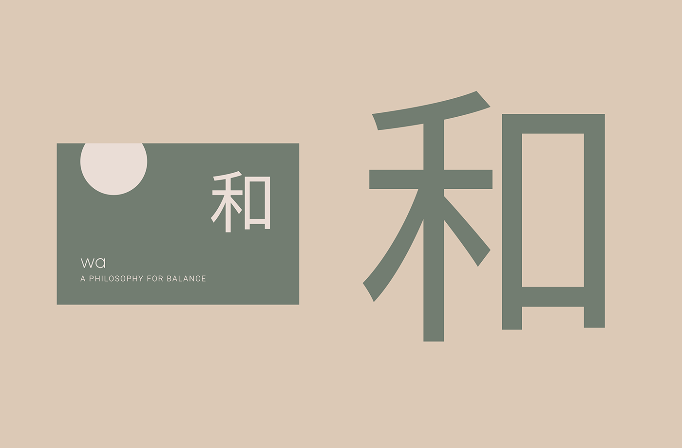
B R A N D P U R P O S E
The Japanese ethos of 'wa' has been taken as the fundamental concept for brand naming, communicating the brand purpose holistically. While the artisanal chocolate has been formulated with the core intent of wellbeing, with the ingredients designed to stimulate harmony and balance within oneself upon consumption, the purpose of the brand had been taken and connected with a Japanese philosophy of 'wa' which embodies the same ethos. With the brand purpose being translated into the brand name, the strategic focus also delved on the aspect of having a culture-centric brand name which conveys the strong focus of the recipe's legacy and philosophy upfront than positioning the chocolate as a delicacy or commodity alone.


B R A N D R E S E A R C H
The Japanese art, aesthetic and cultural ethos have been a major influence in the design strategy wherein the paintings, cultural essence and traditional philosophies have been translated into the visuals, forming the brand narrative and design elements that reflect the authentic narrative of the brand.
Upon research of the cultural elements of the Japanese culture which could be inculcated as part of the visual language, elements such as lanterns and calligraphic letters were identified to represent the cultural ethos of the brand the connect of the traditional recipe that the product is made of.


I N F L U E N C E O F J A PA N E S E A R T
The Japanese art and paintings have served to be a key influence in determining the tonality of the colour palette. The muted pale tones which have been used predominantly in the Japanese art which exudes a serene outlook and acts as a prominent element to convey the aesthetic of the Japanese art has been used for reflecting the aesthetic outlook of the brand.


The packaging was composed in a way that it gives an impression of a Japanese painting, one which is serene, balanced and portrays a sense of landscape within indicative of major Japanese paintings that seeks to portray the serenity of nature through landscapes and nature.

The brand's core philosophy of 'wa' has been kept authentic through the Japanese letters to emphasise on the cultural roots from which the philosophy has been taken from and to convey the significance of this philosophy in the product's core intent, which is to provide balance and thereby positioning it as more than a commodity but rather a ritual and tradition.


The packaging strategy emphasises on the brand's philosophy to be the central focal point for the consumer than the flavour note, wherein the flavours are denoted by the colour coded differentiation of the package but the brand's philosophy comprises the entire package's space.


The colour palette have been derived from the flavours of the product, denoting the significance of the ingredients that forms the basis of the recipe. The tonality of the colours have been derived from the Japanese art to reflect a muted tonality.

Each flavour of the chocolate has been represented by the colour of the ingredient comprising the background of the package, with a saturated and muted tone to exude a premium brand outlook. The full canvas of the background reflecting the ingredient's colour provides a balance of communicating brand as well as flavour through the composition.

F I N A L D E S I G N
The design of the package seeks to be an amalgamation of the strategic focus on reviving the cultural essence of the product to retain the legacy of the family business's recipe, while trying to stay relevant and cater to the contemporary era through modern and minimal design along with the attribute of being a premium product. The focus on staying niche and a homegrown brand while being a premium product while catering to the contemporary millennials while reviving and exuding the cultural essence and legacy of the recipe's philosophy of 'wa' has been the core strategic focus of the design.
The visual translation of the strategy has been implemented through ingredient centric colour palette, elements derived from Japanese art and culture along with a focus on the narrative which is culture centric while positioning as a modern and contemporary brand.


